Build a Funny and Useful 404 Page to Keep Visitors on Your Site

So you are probably wondering what this has to do with anything, or maybe what a 404 page is. Well let me tell you…a 404 page pops up when you search for a page on a site that is not longer there. An error message pops up and says you have reached a place that no longer exists. So now what, well that is when most visitors leave your site.
So you have spent so much time building a unique site and then worked doubly hard to get traffic coming in only to have people leave right away after seeing this error. That is why you should build a funny and useful 404 page. To keep those valuable visitors on your site and give them an option to find what they are looking for rather then just click off.
Why Do I get 404 Pages?
Well despite your best efforts sometimes your links are not correctly linked. Or you moved, deleted, or reassigned a page by changing the permalink just a a little.
How Do Visitors get 404 Pages?
Well sometimes when they are doing a URL search they did not put in the correct page URL like .htm instead of .html or maybe they have a bookmark to a page you have moved or deleted.
So What Should I Do?
Well we talked about it earlier, the best thing you can do is make a new 404 page or modify your template .php file with new text. Some templates do not have a 404.php file or something that easy to find and modify. I know on the template we have used MH Magazine Lite we had to find a file called content-none.php and copy that file to the child theme and modify it. If you are lucky and your theme came with a 404.php page then modify that page. There is a good article on WordPress about this.
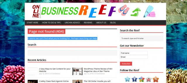
The easiest way to find out what your 404 page looks like is to search for a random page, this is what we searched for (https://onlinebusinessreef.com/wererwerwe.php) so we then could see what our 404 page looked like.

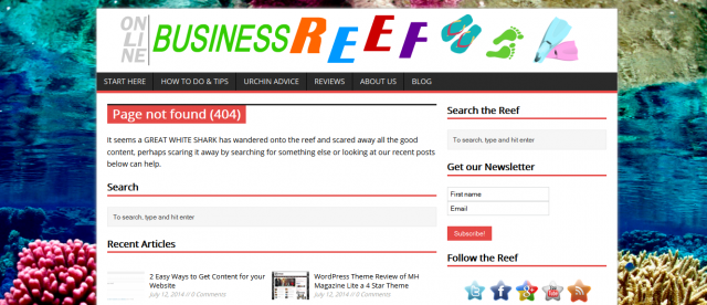
As you can see the standard text was not very exciting and I felt there was not a good supply of articles that visitors could reference if they needed more information. So I modified the file to say something more clever like the page below and bumped up the articles from showing only 6 to showing over 50.
So we changed the text to something a little more funny and better suited to our site and theme. So now the visitor will have something that may catch their eye and more options to choose from so that, hopefully, they will stay on our site.
SO IN CONCLUSION…keep those visitors on your site, let them know you care enough about them to make even the most detailed of changes showing that this website experience is foremost on your mind.
[su_divider]