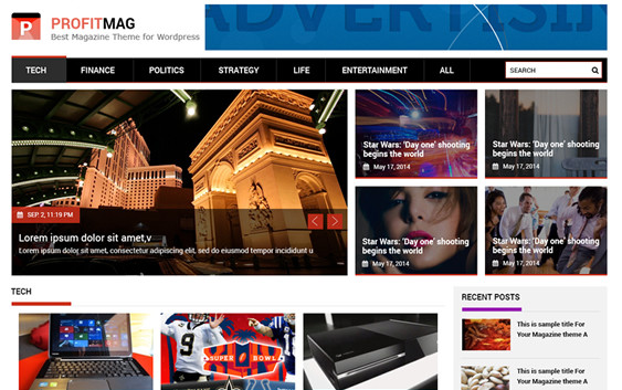
ProfitMag a Change to A Responsive Theme for Mobile Use

So we got a notice from Google that we are not optimized for mobile use. And that our search rankings may not be as high as they could be do to our site not being optimized for mobile viewing. I had not even realized that our theme was not a responsive theme. When I chose it I just saw the words responsive and thought I was OK.
But the responsive part was actually only if you upgraded to the pro version. So I was thinking I was already optimized and had a responsive theme for mobile use when in fact I had just the opposite. So it was time to make a change to a theme that is responsive. This has its own challenges because each time you change themes you have to go through a ton of tweaks. But it was time for a new look so I dove in with a lot of gusto.
I chose the theme ProfitMag which is responsive out of the box and installed it. According to the theme maker Jagadish Timilsina this theme is:
ProfitMag is a clean, responsive magazine theme with elegant design suitable for blogging, News website. It comes with a highly customizable theme option panel that let you manage the website at an instant.
So after I installed it I setup a Child Theme and then proceeded with the customization. Here are some of the tips that we used in the customization of the ProfitMag theme. These will help in the overall ease of setup and save you a lot of time looking for things you need to know.
- If you want to change the Popular Posts section to use your popular posts instead of the default ones then read this post.
- The optimum Featured Image size is 563px by 353px and this will work the best for the slider image on the front page.
- If you want to remove the Featured Image from showing up in your post you can use the code in this forum post in your child theme custom CSS code area.
- There is currently an issue I am having with the Photo Gallery on the side bar showing up as to big and not working with the responsive part of the theme. I will be asking support if they have a known fix and will test their support for this theme.
All in all I like the look of this theme. It is a little busy but you can easily turn on and off the various blocks to minimize the look. I give this them a solid 4 stars and will update this as I go through and use it more.
This is a total scam. This guy writes teasers, just to get people to sign up with a crap program called DisQus. Talk about BS. So be ware and don’t use real info, if you plan to explore more.